Candy Crush Gift Card Redesign
Reimagining the experience of gifting and redeeming with joyful UI and simplified flows
My role
My role
Visual Design
UX Strategy
User Flows
Rapid Prototyping
Year
Year
2025
2025
2025
Category
Category
Consumer experience
Consumer experience
Consumer experience
timeline
timeline
3 weeks
3 weeks
3 weeks
Project link
Project link
Coming soon
Coming soon
Coming soon
Summary
Summary
Summary
Redesigned the Candy Crush gift card redemption and purchase experience for web and mobile. The goal was to simplify complex user flows, ensure brand consistency, and improve the overall user experience by creating a clear, intuitive, and delightful journey from login to reward redemption and purchase.
Redesigned the Candy Crush gift card redemption and purchase experience for web and mobile. The goal was to simplify complex user flows, ensure brand consistency, and improve the overall user experience by creating a clear, intuitive, and delightful journey from login to reward redemption and purchase.
KPIs
KPIs
KPIs
Improving user confidence
Reducing friction
Drive higher conversion rates
Improving user confidence
Reducing friction
Drive higher conversion rates
Problem Statement
Problem Statement
Problem Statement
The existing Candy Crush gift card flow was confusing and inconsistent, leading to user frustration and abandoned purchases. Key issues included unclear redemption steps, inconsistent UI elements across platforms, and a lack of clear visual queues and redirections. This negatively impacted user trust and conversion rates.
The existing Candy Crush gift card flow was confusing and inconsistent, leading to user frustration and abandoned purchases. Key issues included unclear redemption steps, inconsistent UI elements across platforms, and a lack of clear visual queues and redirections. This negatively impacted user trust and conversion rates.
User Research
User Research
User Research
To understand the challenges, we conducted user interviews and analyzed support tickets related to gift card redemption. Key insights revealed users struggled with:
Locating and entering gift card codes correctly
Uncertainty about account login requirements
Confusion due to inconsistent UI and terminology
Lack of clear feedback on success or errors
This research helped shape the redesign priorities focused on clarity, consistency, and reassurance.
Pain Points
Pain Points
Pain Points
Confusing redemption process causing drop-offs
Inconsistent UI across mobile and web platforms
Lack of clear guidance and feedback during steps
Difficulty verifying if users had a King account
Poor visibility of benefits and incentives
Confusing redemption process causing drop-offs
Inconsistent UI across mobile and web platforms
Lack of clear guidance and feedback during steps
Difficulty verifying if users had a King account
Poor visibility of benefits and incentives
Solution Overview
Solution Overview
Solution Overview
The redesigned experience introduces a cohesive end-to-end flow for both gift card purchasing and redemption. Key improvements include:
A simplified 3-step redemption flow with upfront clarity
A structured purchasing journey, optimized for mobile and web
Clear CTAs, feedback states, and inline validation for smoother interactions
Refined visual language aligned with the Candy Crush brand
Modular UI components and layouts to support scalability
Strategic messaging to guide, reassure, and drive conversions
Research & Discovery
Research & Discovery
Research & Discovery
To better understand where users struggled, I ran a UI audit across the current gift card flows and examined competitive benchmarks like Lululemon and Apple for modern gifting experiences.
Key findings:
Visual inconsistency: I noted a mismatch of shadows, button styles, and illustration treatments — suggesting outdated assets and lack of design cohesion.
Missing contextual support: FAQs were buried, and there was no quick way to check if you had a King account — a known blocker during login.
Scattered purchase flow: Entry points for buying gift cards felt like afterthoughts, reducing their discoverability and impact.
Mobile neglect: Layouts weren't optimized for smaller screens, with clunky spacing and tap targets.
No system feedback: Errors (like invalid codes or empty states) weren’t clearly communicated, leaving users stuck.
These insights shaped the design direction by confirming we needed to prioritize clarity, consistency, and guidance — especially for casual users unfamiliar with King accounts or digital redemptions
Design Process
Design Process
Design Process
I structured the redesign into two parallel flows — one for redeeming a Candy Crush gift card, and the other for purchasing one. My goal was to elevate the experience from functional to delightful while reducing confusion and drop-off.
1. Flow Mapping & Simplification
I began by auditing the existing flows and identifying friction points:
Too many unclear steps
Lack of visual hierarchy
Important actions buried or overlooked
I mapped both flows, condensed steps where possible, and prioritized clarity and speed — especially for mobile users.
2. Wireframes
Using low-fidelity wireframes, I explored layouts that balance content, branding, and functionality. Key considerations:
Should the “Buy” and “Redeem” CTAs live together?
How do we make the progress indicator both fun and useful?
What happens if the user enters a code with zero balance?
This phase helped align on structure before diving into visuals.
3. Visual Design & UI Exploration
Once flows were approved, I translated wireframes into high-fidelity screens using a consistent visual language. Highlights:
Built a modular UI system with spacing based on an 8pt grid
Created reusable components and variants in Figma
Added subtle shadows, gradients, and candy-like visual cues to bring joy without overwhelming the interface
4. Edge Cases & System Feedback
I paid special attention to:
Empty or invalid inputs
Users who don't have a King account
Gift cards with zero balance
All of these now trigger contextual feedback to guide the user smoothly.
5. Developer Handoff
The final Figma files were structured with:
Separate pages for preview and dev-ready files
Clearly labeled components and variants
Notes for responsiveness, auto layout, and validation rules
Final Designs
Final Designs
Final Designs
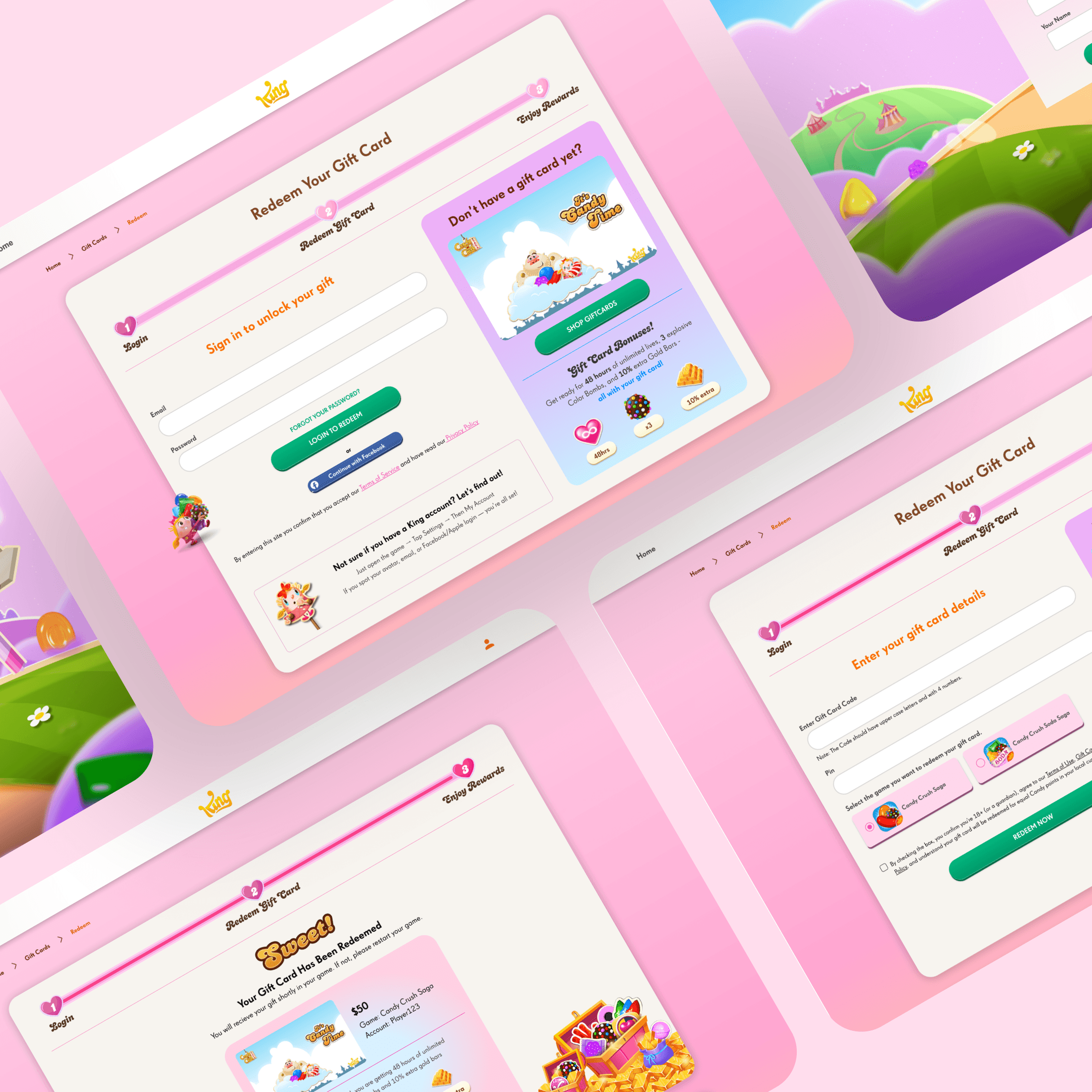
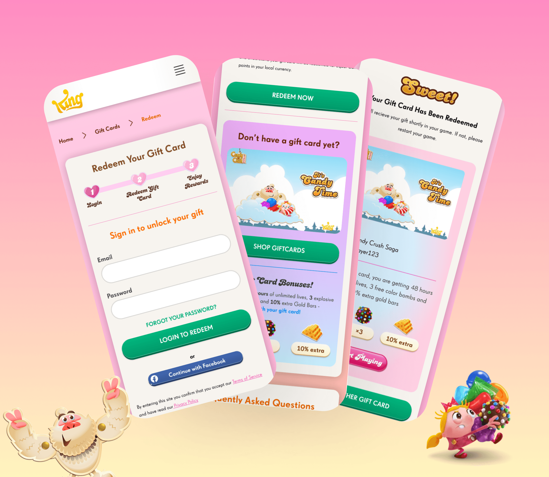
A side-by-side view of both Web and Mobile flows for the Buy and Redeem journeys — built to reduce friction, drive conversion, and feel unmistakably “Candy Crush.”
🎁 Redeem a Gift Card
Goal: Help users redeem a gift card quickly, even if they don’t have a King account.
Old Experience Redesigned
Overwhelming visuals, weak CTA hierarchy, and lack of in-field guidance made the process confusing. Streamlined UI, joyful visual tone, improved form logic, and helpful notes make the experience friendly and effortless.
Key Improvements:
Progress bar merged into login step to declutter layout
Highlighted help for users unsure if they have a King account
Contextual error messages and redemption success feedback
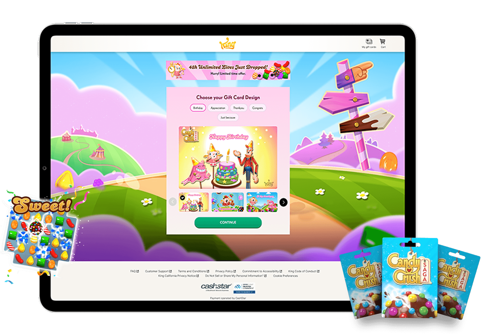
🛍️ Buy a Gift Card
Goal: Make the buying journey clear, value-driven, and conversion-friendly.
Old Experience Redesigned
Generic layout with minimal brand flavor. No clear incentives or visual hierarchy. Delightful layout showcasing bonuses, supported delivery methods, and a stronger CTA strategy.
Key Improvements:
Step-based flow with visual guidance
Added support for Google Pay, PayPal, and cards
Upsell incentives like “48hrs unlimited lives” clearly shown
🧰 Supporting Screens
Manage Gift Cards: Track orders, view balances, and resend easily
Gift Card Received: Visual confirmation with reward details
FAQ & T&C Pages: Restructured for clarity and mobile-friendliness
A side-by-side view of both Web and Mobile flows for the Buy and Redeem journeys — built to reduce friction, drive conversion, and feel unmistakably “Candy Crush.”
🎁 Redeem a Gift Card
Goal: Help users redeem a gift card quickly, even if they don’t have a King account.
Old Experience Redesigned
Overwhelming visuals, weak CTA hierarchy, and lack of in-field guidance made the process confusing. Streamlined UI, joyful visual tone, improved form logic, and helpful notes make the experience friendly and effortless.
Key Improvements:
Progress bar merged into login step to declutter layout
Highlighted help for users unsure if they have a King account
Contextual error messages and redemption success feedback
🛍️ Buy a Gift Card
Goal: Make the buying journey clear, value-driven, and conversion-friendly.
Old Experience Redesigned
Generic layout with minimal brand flavor. No clear incentives or visual hierarchy. Delightful layout showcasing bonuses, supported delivery methods, and a stronger CTA strategy.
Key Improvements:
Step-based flow with visual guidance
Added support for Google Pay, PayPal, and cards
Upsell incentives like “48hrs unlimited lives” clearly shown
🧰 Supporting Screens
Manage Gift Cards: Track orders, view balances, and resend easily
Gift Card Received: Visual confirmation with reward details
FAQ & T&C Pages: Restructured for clarity and mobile-friendliness
Results
Results
Results
While the full launch was paused due to internal constraints, the project delivered a complete and production-ready redesign that:
✅ Modernized the gift card purchase and redemption flows across 34 screens for mobile and web
✅ Reduced visual debt by introducing consistent UI components and scalable design practices
✅ Enhanced conversion clarity with streamlined CTAs and refined UX copy across flows
✅ Delivered developer-friendly files with clear notes, variants, and structure — enabling smooth handoff
✅ Received full stakeholder approval on the first round of review